
Bubble Grid Visual
Explore the intersection of two attributes.
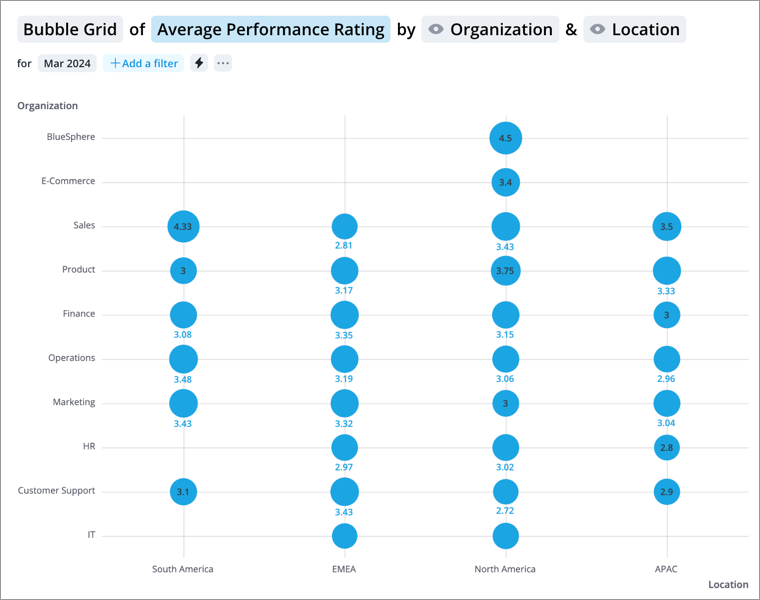
The Bubble Grid visual is used to explore the intersection of two attributes and shows the pattern of metric values across a set of groups. On the Bubble Grid, you will find a attribute plotted on each axis and data points represented as bubbles. For example, if you look at the Bubble Grid of Average Performance Score grouped by Organization Hierarchy & Location, you will see members of the Location attribute (APAC, EMEA, North America, etc) on the horizontal axis and members of the Organization Hierarchy attribute (Operations, Sales, Finance, etc) on the vertical axis. Each bubble shows the calculated metric value for the intersection of the two dimensions. For example, the North America-Sales bubble shows the Average Performance Score calculated for the Sales organization in North America. The size of the bubble reflects the magnitude of the metric value, so you can easily identify the differences between groups.
How to explore the visual to gain insight
- Look at the chart to answer questions like:
- What was the overall value of the metric during the period?
- Which groups had the highest or lowest metric value during the period?
- Click a bubble to see a summary of the group in the Info panel.
Tip:
-
Right-click on a chart item or data point to open the Visual Item Actions menu. Find actions that will allow you to quickly interact with points of interest. Actions include drilling up or down to view different levels of your data and accessing the Detailed View visual to see a list of subject members or event occurrences that make up a given population.
-
By default, zeros, null (N/A) values, and the Others data item are hidden.
-
To change the default settings, click your User icon
 > Preferences
  > Charts.